07 Aug Accipio’s Ignite Theme: Empowers your Admins to Create Instead of Wait
Posted at 16:21h
in Other
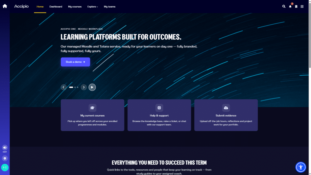
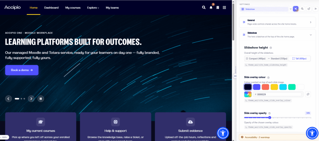
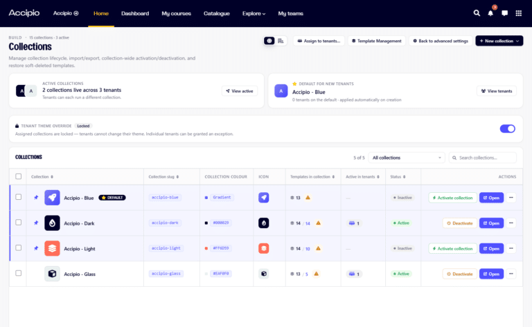
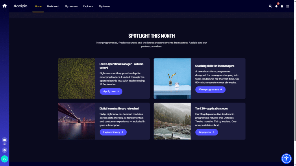
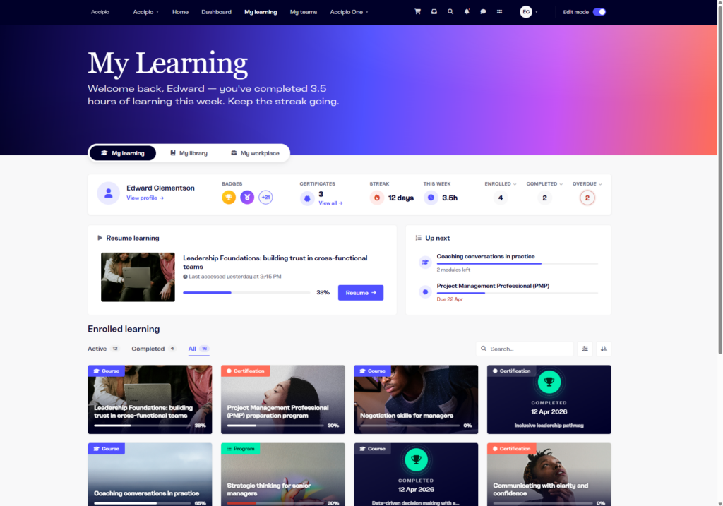
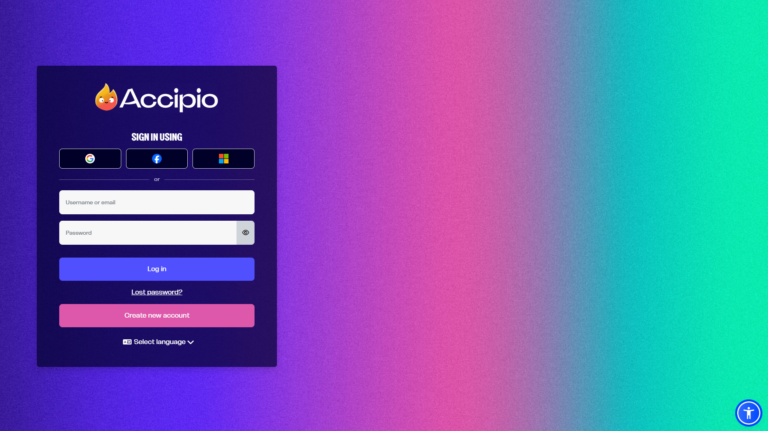
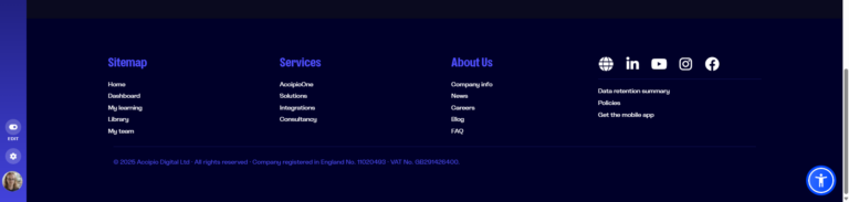
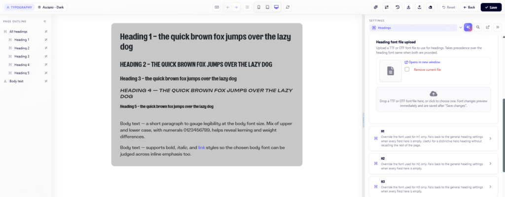
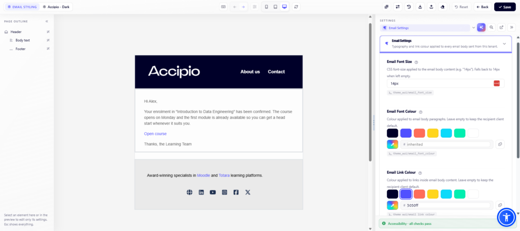



Ignite gives your L&D teams something most learning platforms don’t: complete, real-time control over how the platform looks and behaves, right down to the detail, without a developer needed at any stage. Branding, layout, navigation, promotional content, and even the emails your platform sends automatically, all of it becomes something an administrator can shape directly, see instantly, and change again in minutes rather than days.
That level of control exists because of how Ignite itself is built. Ignite is Accipio’s own theme, engineered entirely in-house and available exclusively to Accipio clients, and it grows in a specific way: when a client asks for something specific, our development team builds it for them, and where it’s clearly useful beyond that one client, we build it properly into Ignite, so it becomes part of the platform every Accipio client runs. Most of the features below started life as exactly that kind of request.
Two things run through everything that follows: empowerment, giving your team direct control over branding and layout without needing a developer for every change, and efficiency, a design process that’s more flexible, more powerful, and genuinely simple to use, so admins can achieve more with less effort, even when the change they want is a complex one.
This round of development is available now within Moodle Workplace, with Totara LMS support planned for a future release.
Because Ignite is unique to Accipio, this work makes our Moodle Workplace, and eventually Totara offering substantially different from other providers. None of it can be replicated by moving to another Moodle provider, or by staying on a generic Totara build. It exists only here, for our clients, which means it’s something they genuinely can’t get anywhere else.
The centrepiece of this round of work is the live WYSIWYG (, “What You See Is What You Get”), visual editor: a real-time page and component builder, complete with desktop, tablet, and mobile views.
Administrators can build and adjust pages directly, checking exactly how each change looks across every device before anything goes live. Version history, side-by-side comparison, and a proper undo function remove the risk from experimenting, so there’s no more saving a change, refreshing the page, and hoping it looks right. This is empowerment and efficiency working together: real design control handed to the administration team, achieved with far less effort than the old save-and-refresh cycle ever allowed, and with no developer required at any stage.
Global and tenant template collections allow two different kinds of template to exist side by side.
A master brand template can be created once and rolled out uniformly across every tenant in Moodle Workplace, while individual tenant administrators can still build localised versions for their own users where that’s needed. It saves hours of duplicate work: instead of every department, franchise, or client organisation rebuilding the same design decisions from scratch, they inherit the master template and only adjust what’s genuinely different about their own space. Central control and local flexibility sit alongside each other, rather than working against one another.
Site Home turns Moodle into an open landing page, with carousels, quick links, highlight cards, and promotional tiles, so the first thing a visitor sees is a proper introduction to the platform rather than a login box.
Marketing Sections take this further, letting administrators build website-like pages anywhere in the platform, mixing images, text, and calls to action, and choosing whether that content shows to logged-in users, logged-out visitors, or both.
The expandable sidebar houses navigation, the course index, edit controls, and the user profile in a single, clean panel, and it’s retractable, so administrators and learners can collapse it out of the way entirely when it isn’t needed.
The result is a genuinely decluttered screen, with eyes kept on the actual course content rather than menus and settings competing for attention around the edges. It’s a small structural change with a real effect on how focused the learning experience feels.
A learning platform’s homepage often ends up static, while the organisation’s actual promotional effort goes into email and social media instead. This round of development gives administrators several ways to change that.
Homepage slideshow. Configure a specific responsive height and aspect ratio for any device, and use it to drive attention toward a course, an event, or a piece of content, with an image, text, and a call to action.
Marketing Cards. Promote key courses or information in any block region of the platform. Fully responsive, and fully under your control for branding and appearance.
The remaining work is about consistency in the details that are easy to overlook. Login and identity providers. Login screens and identity provider buttons can be styled to match the platform, so single sign-on feels like a natural extension of the brand rather than a jarring handoff to somewhere else.
Multi-Login Enhancement.
Create and manage sections for standard login, self-registration, single sign-on, and guest access, and set a default tab so first-time users are guided straight to the right option.
Dynamic banners and sitewide footer.
Banners on the dashboard and course catalogue set the tone for each section, and a configurable footer keeps compliance certificates, quick links, and social channels accessible without cluttering the page.
Social Icons and Logos.
Add an unlimited number of clickable links to social platforms or other external sites using preset or custom icons, and cycle automatically through a curated selection of partner or sponsor logos, a small detail that does real work in building trust with a new visitor.
Typography and email.
A typography engine allows custom brand fonts to be applied platform-wide, rather than falling back on generic system fonts, and the Branded Emails add-on brings automated system emails into line with the wider brand, set platform-wide or configured differently for each tenant.
None of this is arbitrary. Each feature above exists because a client needed it, and because our team judged it valuable enough to build into the platform for everyone, rather than keep it as a one-off. Ignite keeps improving in step with what our clients actually need, rather than sitting on a fixed release schedule set in advance. For organisations managing multiple departments, brands, or client tenants within Moodle Workplace, the combination of central control, local flexibility, and continuous development is often what determines whether a platform gets properly adopted or quietly gets worked around.
Ignite is exclusively available through Accipio and is now embedded in our Moodle Workplace LMS solutions. If you’re already running Ignite, it’s worth checking with us whether these updates are compatible with your current version.
Visit our website to see the full range of LMS solutions and what they could mean for your organisation.