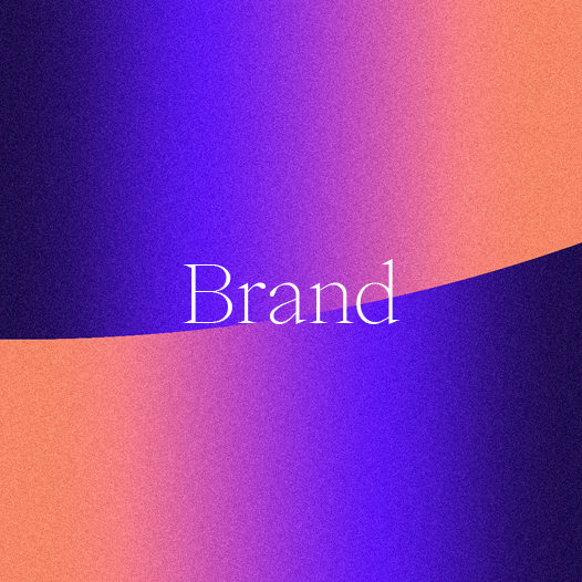
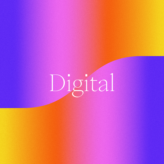
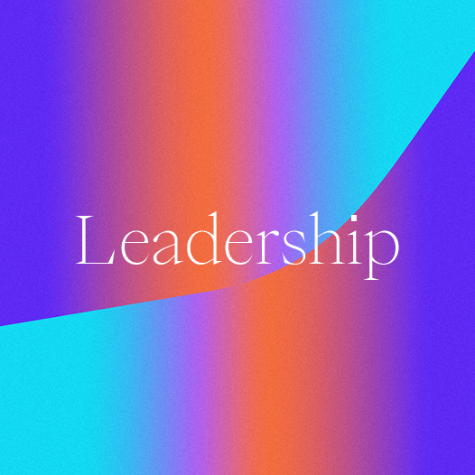
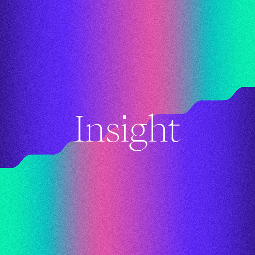
Colour gradients express transformation, progress, and the promise of new possibilities, while our graphic language visually depicts different forms of positive change – each featuring a central catalytic point where colours blend together, shifting focus from the spark that starts things to the light of the goal being aimed for.
Taken all together, we’re confident it conveys the active, change-making organisation that we are. We hope you enjoy our new brand, and are as excited as we are about continuing the journey together.
